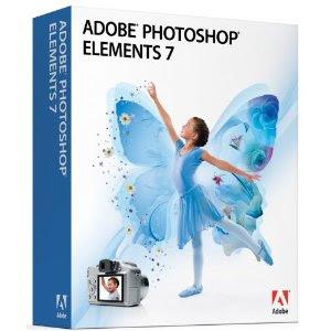
 Before I start on anything else... I repeat....... you can do all this by cut and paste if you do not have a program such as photoshop..... BUT Photoshop 7 (New Version 8 is out) is still available at Amazon for $42.99 or less... It is the old version and perfectly good for anything I would ever want to do... So if you are thinking of exploring this, do buy now as they will be gone soon and it's a real bargain as the New Version 8 is much more expensive....
 While you are buying it get "Photoshop 7 for Dummies." for as little as $4.28.... I learned my program with a "Dummies" book doing one chapter at a time and practicing...
So for less than $50 you can get software and manual that will you can use creatively forever.
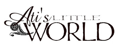 Now that I've covered finding a type font you like, try combining several different ones as I did in Ati's logo... Each word is a different font... "Ati's" is Amazone, "little" is Wretched and "world" is Mordred. You can even have 2 or more fonts in one word... Just play, play, play around with it...
And I've also added a decorative element..See if you recognize it as we go on..
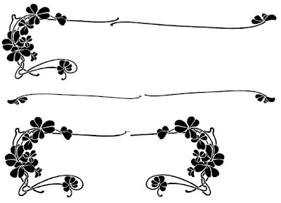
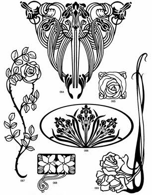 I just can't recommend Dover publications highly enough and most now come with CDs to put it right on your computer. But when you look at their copyright free art keep in mind that it can be used in parts and try to visualize the parts separately.
For example... I just used part of this illustration... one I put a black frame around
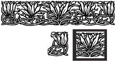
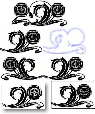
With this one I used different parts in different ways and different directions.
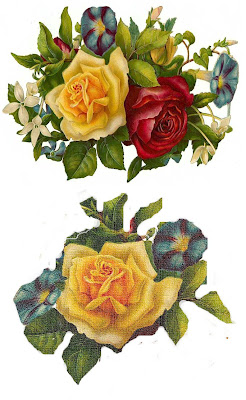 Do the same with colors pieces like this rose motif... Using parts changes it entirely and makes it look less like clip art. (to me anyway)
Finally even the most fundamental photo programs allow you a lot of options and photoshop even more.
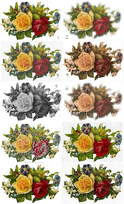 #1 is the original and the others are at least one special effect or more... #2 has a soft glow added. #4 is antiqued #6 is antiqued and a soft glow added. A grainy texture is added to #3. etc. etc.
And remember SNIP AND TUCK.... any decorative element needs to be tucked into the lettering and design.......
Several readers asked about how I did my header so I will add one more post in a few days to show that.



.jpg)

3 comments:
Gerry, THANK YOU so much for the logo. I love it !!. You are so clever to do those things. I don't have photoshop at all and if I had it, it probably would be too difficult for me. I have to look for a Dutch version, maybe that will do it for me ;)
I must say, useful information for users especailly for website designers.
-----
Logo Design
Thanks so much for these tutorials, Gerry. My blog needs a kick in the butt and I'm thinking it might start with a new logo!
Post a Comment