It is a reminder just how exciting and dramatic just subtle changes in color can be...
 These are three recent ones... The bluish purple grapes were especially timely as I've been using those colors on my spider bag.

 These are three recent ones... The bluish purple grapes were especially timely as I've been using those colors on my spider bag.
 Now that I have the mechanics of making the flowers pretty well sorted in my mind I want to concentrate some now on colors. I said last post that I wanted muted colors...This palette on the right is one of the palettes that comes up when I put "Victorian color palette" in Google. It is basically what I want but some blues and more variety in value.
  This palette is getting there. It has some more intense values and a bluish gray/green.

 I did run across a few palettes that I added to my color file for future possibilities. I find that using a color palette as a guide opens up new color combinations for me and also serves a guide for adding just that extra color that brings other colors to life.


 My very least favorite palette is jewel tones. I have only used it once as the challenge option when I made my vest and this was as far out of the box I could get. Although I am happy with the vest but I will never use this palette again. The colors were too bright and intense and actually made me uncomfortable when working on it even though I did add black to temper the brightness of it. I certainly stand out in a crowd when wearing it.
 Somehow I started on a series of block composition and am ending with my usual lecture on color....but since I feel strongly about the subject I will proceed. The majority of people in the US struggle with color....we are not comfortable with color on our bodies, in our homes and in our surroundings. And I am a prime example. My comfort zone is neutrals and pastels....in fact EVERY room in my house is a shade of beige. I make a conscious effort to break out of this comfort zone and if I didn't everything I stitched would be neutral or pastel.
 I would love to live in a culture that celebrated color in their clothing...
 But I don't and thank to a challenge years ago by Laurie Bergesser I regularly make a concerted effort to emerge from my comfort zone.....and I am ALWAYS glad when I do as those works are among my favorite.
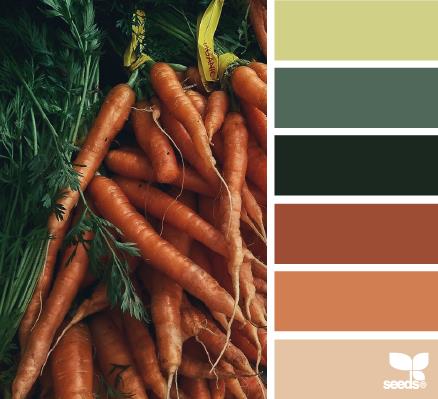
 I wrote a whole post on "Color Seeds" which I love, love, love and has taken me on some interesting color journeys. This post and that site should not be missed. There are options there for every taste...
 I often use a color pile before I make my final choices... Put possible choices in a pile.. toss it about several times accessing what doesn't fit.. It's easier to pick them out of a pile then to deal with them later in a block.. If you look at your fabrics in a pile and like them, toss them around a few times and still like them, they are going to look good on a block no matter what you do... This is the "pile test",
  I do mine on a table but I just noticed on Facebook that Allie posted her pile of fabrics on the floor. I think that is a great idea because you get a better perspective..
 Yet to appease her thirst for bright colors she uses them with abandon making dozens of these scrappy quilts.. They work because of the multitude of colors at random... You cannot fail making one of these quilts and the same approach is true applied to crazy quilting...


 When it comes to color I tend to be analytical. I love monotones, pastels and subdued earthy colors..and colors I choose are always directly related to my moods. So I'm always fascinated by people who use pure colors and lots of it... The first retreat I went to in Colorado I saw a large piece by Lauri Burgessor and was immediately in love with it and her... It was her endearing "Romance Novel" quilt. This butterfly is one of her latest. Of course she is a superb stitcher but it was her use of color I found especially exciting. She doesn't blog nearly enough but I see that she did today..
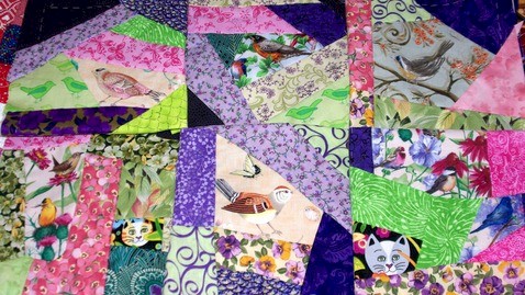
 And then there is Allison Aller who I swear I saw skipping in CT. Her love of color is pure joy and if you haven't seen her "Jill's Quilt" she did for a cancer charity you must..
 For the April workshops I will have to make several blocks so have been looking for inspiration for color combinations.. And ever since I did Jeanne's purple and orange block I've wanted to explore orange some more...


.jpg)
