6/23/2010

Logo Design - Part Two....

Please keep in mind that this is just MY way of doing logos... I do mostly logos with type because I love typography. I've mentioned before that I recommend http://dafont.com/ because most of the fonts are free and because you can do a preview of a font with your text..


Jo shamelessly begged me to turn her blog heading into a logo...well Jo's blog headline is long enough to quality as a short story.... ON THE OTHER HAND if you received an email or post signed Jo Newsham you might not know who it was, but if it was signed Jo in NZ (as she always does) you would know exactly who it was... "Jo in NZ" is simple, recognizable, and unique to her....perfect for a logo.... So searching for a type style for her I went to http://dafont.com/ ...

1. type in your words or words in custom review box . You might try entering both caps and lower case, all lower case and all caps to see what you come up with...
2. select 50 fonts to a page medium size
3. select sort by popularity since most of the best one are on the first pages of each category....


Once you select a category such as calligraphy all the fonts will show up with your words..


So after doing that and browsing through a lot of fonts I found the following two I liked:
Folkard and Charming... I was particularly looking for fonts that had interesting Js and Zs.. In most fonts Js are not too interesting but I loved these two....


Below each preview it will show the entire alphabet of that font.
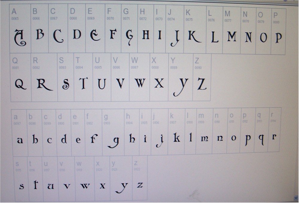
Obviously once you have picked a font the easiest route is to download the fonts because they are free but there's another option.....the old-fashioned way.. which I opted for because I didn't particularly want to download these fonts on my computer...


I just taped a piece of paper to the computer and traced the letters with pencil.. If you were using rub-off sheets of lettering (scrapbook supplies) you could do the same thing.

Once I had them traced I just cleaned them up with a straight edge and ink...


At this point they don't look much like a logo...


And here is where the fine tuning comes into play..what I call "snip and tuck". The space between the letters is called kerning... In my publishing program I can adjust the kerning but it I were to do it in photoshop or something similar I would simply enter each letter separately and adjust them manually.


The middle "older rose" is how the computer spaced it....There is a really awkward space after the R. Below it you can see what happened after I adjusted them and tightened the letters.. I like overlapping letters and using different base lines...


But my favorite way is to make several copies of the letters different sizes and cut them up and play with them in different positions.. I'm a big time cutter-upper and do it with type and other elements in most projects I do...


And this is exactly what I did and found I like both fonts in this layout... but the font "Charming" reminded me of Jo's stitching style... Sorry Jo this is the best I could come up with... Which one do you like best???


And this is exactly how I came up with my logo... Next I'll talk about the artistic elements and additions but probably not until next week as the days are filled for the near future... Sorry but as you can see this got longer that I had anticipated...
addendum: I was asked what software I use... I do have Photoshop Express but seldom use it because I had gotten used to a similar, obselete program called Microsoft Image Composer... simpler but adequate for what I do...

6/22/2010

Question from reader......


Question from Laurie: With mine though, the whole point is that I HATE being called crafty, so wouldn't enlarging "crafty" making it the focal point? Kind of counter productive to my whole train of thought. Just curious as to your thoughts!

The answer is a definitive yes and no... Making a word (or words) larger does make it a focal point but only in that it defines the space or shape of the logo. BUT it doesn't make it more important. .. ALL words or pictures in a logo are necessary and of equal importance. In fact any guy can tell you that there is no correlation between size and importance...

As an example I have a personal logo that I have used for umpteen years.... The bold colorful letters in the word chaos are the "focal point" because they define the space and shape but are no more important than the minimized word "organized". In fact without the minimized word the whole logo loses it meaning.... I love this play on words with fonts, shapes and sizes...


Another visual example is the leaf is the focal point as it defines the space and without the tiny type it has no importance at all...


So when I made that sketch I was thinking you can call me anything but don't call me CRAFTY!!! With a successful logo all parts need to work as a whole and any part removed distorts the message or image. Does this answer your question.?...hope so...but I will cover this more when I get to the next section which will include "snip and tuck."

6/21/2010

Creating a Logo

Bear with me as I will try to be coherent...not one of my strongest points... I've decided to divide this into 3 posts.. Today I will cover how you might use a logo and choosing your words.... The second part will be choosing a font and manipulating words and letters... Finally the third post will cover adding artistic elements...

Your logo needs to be simple and flexible.... A design that may be great on a banner might be unreadable on a business card.... So before you start give some thought on how you might use your logo in the future.... If it's just for one use it would be easy but when you think about it everyone needs business cards and if you're going to sell things at all the list of uses grows quickly...

Besides my possible list of uses above you may want an adhesive one to put on your car or a banner for a booth in a quilt or craft show....I really don't think I'll put it on t-shirts but I added it just in case because I think it would make a cool t-shirt... Also now's the time to think about how much information you want to share on your cards, etc. Personally I don't want people to have my home phone or address except on a letterhead. It's expensive to have things reprinted if you make a wrong choice at this point.


This whole subject came about because of a recent email from Cathy Kizerian... She's changing directions in what and how she wanted to sell... Her blog is called "Cathy's Crazy by Design" and she is identified by that but she felt it was too long for a logo or tags etc... I felt she had some options to shorten it and she's working on it now....

She could eliminate "Cathy" and focus on "Crazy by Design" or focus on "Cathy's Crazy" and minimize "by design" which I think she is doing... Below is examples of what I sent her as options. Please be forgiving as these are just rough sketches. These all use the same words but size and placement can make a big difference...


It's best if you can just focus on one or two words... If you are just using your name that's great. But if you already have a longer blog or business name you need to find one or two words to focus on... You can have other words but they must be mimimized in the overall design... As examples I pulled some names of blog that I visit often and chose one or two words of each to focus on... They all are several words long... Again forgive the rough sketches but if I were to begin designing a logo for these people, this is where I would begin.....by picking the words to focus on....
Next time I will address how to find a font you like and how to manipulate words and letters into a logo...
And I hope this makes sense... And if you're one of the people who weren't interested in this tutorial.... come back next week...


6/20/2010

My Cascading Dinner!

Yesterday I prepared a meal for twelve and set the table on the deck because my house is too small to seat that many inside... . The food was on the table, the wine was poured and everyone was seated...AND THEN one side of the deck collapsed.... And indeed all the tableware, food and wine (red) went cascading off the table onto everyone on that side of the table... Thank heavens no one was hurt but what a mess... We salvaged the rolls and the roast and luckily the dessert was still in the house.

6/18/2010

Karrin's Stumpwork Block


I received Karrin's stumpwork block from yesterday and both Cobi and Diane have worked on it. Karrin wanted a garden on her block and it's well in the way... Since I'm third in the rotation I have to work with what's been done already and certainly not add anything that wouldn't be compatible, either in color or design...

Of course I have a plan in mind and I usually share with you but this time there will be a "surprise" bit of whimsy as my last addition...

But I can share some thoughts.. First there are about 9/10 strong vertical elements on the left side of the block..... I would be very remiss indeed if I didn't add at least one strong vertical element on the right to balance and frame the block... In addition I will work some horizontal elements into the block from right to left. I'm not just sure what at this point but it will help move the eye across and around the block.. The golden yellow of the sun flower is so strong it needs to be repeated somewhere...

I love what Cobi did to soften the rock fabric... Wait for the whimsical surprize!!!
p.s. there seems to be enough interest for a logo tutorial so I will start on that... It will need to be divided into several posts...
Related Posts Plugin for WordPress, Blogger...

Popular Posts