Showing posts with label tutorial. Show all posts

12/18/2016

What to do with tips and tutorials

 
This tiny fan ornament is only about 3" across at its widest point... impossible to cut and sew such tiny pieces so I devised a easy was to do it...
This was for the Needlework Guild Christmas ornament exchange about 7-8 years ago... I ran across this tutorial while looking for something else and realized that these instructions REALLY needed editing and clarification. It wasn't even labeled as a tutorial....  

Lisa Boni said I should gather up all my tips and tutorials and put them in a book and I find I have over 100 posts that would fall into these categories..  No book but I will start going back through the blog and organize and update these and make an index....

These are the old instructions and   really need  more pictures and explanation and maybe someone could use it for 2017...  So sometime soon I will redo it and add a pattern.  This would make a great mini workshop for CQ beginners.

Rather than cut out tiny fan pieces I drew the fan on muslin and did it "flip & stitch" working from the back and trimming as I went.... much easier... I  embellished with beads, added SRE and lace...
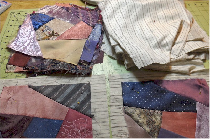
I also ended up with a nice pile of "crumbs" of these fabrics

10/14/2016

Adding type instead of an image.

Sometimes I like to add some wording to a block that has a theme.  Such is the case of this block with a rabbit theme.  This little poem was too long to stitch so I used my favorite method of adding words to a block...

Here it is on the entire block and it is the perfect final touch.


On my current project inspired by my anniversary sampler, I wanted to use the original words on the sampler.  My original plan was to cross stitch the words petit point but it just wasn't going to work.


So I scanned it and printed it on paper-backed cloth made for image printing.  I use a cotton variety but there are also silk sheets available.  I personally like the cotton better because it has more body and is more dense.  I just rough cut what I want to print and will trim it after I have the Wonder Under on the back.

Wonder Under is a fusible paper-backed web made by Pellon.  It comes in two weights and I prefer the heavier one.  It is readily available at fabric stores and is usually shelved with the interfacings.  It is widely used by stitchers doing applique.

I want to mount my wording  on felt.  The problem is that even the denser cotton is very transparent once the paper backing on the image is removed.  First if you are using a colored felt, the color will show through and spoil the image.  Second often the fibers of the felt might also show through when attached to the fabric with the image.

To get around that problem I attached the image FIRST to a piece of plain white cotton or muslin.  I use Wonder-Under to attach it.

Here are the materials assembled.... image on fabric, wonder-under, cotton square and colored felt.

After the image is backed with Wonder Under and ironed to the cotton/muslin square I trim it to size and attach ANOTHER piece of wonder-under and iron it to a larger piece of felt.


 Once it is attached to the felt I trim again leaving about 1/8" of felt exposed.  And it is looking like this.. There is nothing turned under so it will lay flat and the wonder-under keeps any edges from fraying.  Now it is ready to attach to my block.

Sometimes I use trim on the edges or just attach with tiny stitches and/or beads.  Here I am using trim across the top and beading around the rest of it.


The smaller image of our name I just attached with tiny stitches.


The first time I added a poem I just printed it on silk and turned the edges under.  It did not lay flat and the needlework underneath showed through.  I was not happy with it.  It was lumpy and wrinkled.


When I was working on my Morris book I wanted it to be "interactive" with flaps that could be lifted with an image underneath.  The flap needed to be even more firm so I added another step with two pieces of felt.

When you lift this flap there is a wild turkey underneath.  I have these flaps throughout the Morris book.   I added the flaps with beads as "hinges."


When I did the book about my sheep I used the same technique to add a poem, names, and other information.


I know someone will write and ask how I got the curve in the type of the rabbit poem.  Years and years ago I downloaded a little free software program called "Type Twister"  I just love it but it is no longer available and it now only works on my old computer. It is a fabulous little program and so sorry it's not compatible anymore.


6/16/2016

A tip to file away!


Quite by accident I discovered you can modify the width of the end result of this ruched ribbon no matter what the width of the ribbon.  The book's instructions have you mark the gathering lines according to the width of the ribbon.... which I did (A) and the end result was too wide....


But if I narrowed the spaces between the triangles I got a much narrower end results.

1/18/2016

Cut-away transfer AGAIN!!!


Of all the things I have shared I feel my method of cutaway transfer is the absolute niftiest.  If I want to transfer a design or image to a fabric with texture (velvet, linen, lace, etc) or a fabric that has a prominent print or    fabric that is too special to make any mark on, I ALWAYS use this method and apply it to the BACK of the fabric.  There is already a tutorial on this blog but I will go though the steps once again...

Since I work from the back of the fabric  I need a reverse image of my design.  Then I apply an iron-on interfacing to the back of the fabric.   I mark my image into sections. 

I then cut out the reverse image I want to transfer and lay it on the interfacing and trace around the whole image.

Please note:With birds I do not cut out the beak.  I always apply the beak at the very last.


Then I start cutting off the smallest outside bits.... in this case the top of the head and the tail.  Then I place the image back on the interfacing and make a line where I cut away.


I just keep cutting away bits and marking where I cut.


Eventually I was down to the wing which was the last part to cut up.


You can see what is left of the paper image as I cut it all up into small bits.


Then I do some basting with a contrasting thread on the lines...


And when I turn it over  I have my bird on this velour fabric.  There are no marks or chalk  or tissue paper to deal with and the basting stitches are easy to remove as I go along.  You would be amazed how easily and quickly you can transfer even very complex images this way.

So I have gathered my metallic gold threads and sorted them from light to dark and will soon show you how I start the stitching.

12/21/2014

Final steps before embellishments begin..

This is the last in this series of blogs about preparation of blocks for stitching... 

If I'm doing one block or larger blocks, sometimes I will flip and sew the patches to the foundation as I go.  But when making so many blocks at once, I just piece  the blocks as you see upper left and then put them on a foundation.  For block foundation I LOVE old well-washed sheets.

Then I pin a block to the foundation and do a long stitch on the machine to hold it in place.  If I had a machine which did zigzag I'd probably do that.  But since my machine only does straight stitch...  that works also. I always make my foundation at least 1-2" larger than the block because I often want to use a hoop.

I use  home-made squares to mark my basting lines on the BACK of the block.  I started cutting these squares out of old matt boards years ago and I now have every size from 6" to 12" in 1/2" increments. They make this part easier and I can recommend adding them to your list of tools.  They come in handy for other tasks also...  I use them over and over.


On the BACK of the block I trace the exact size of the finished block and inside that I trace the square that is 1/2" size smaller.  I use two different colors and run a basting line along each line. 


When you turn it over this is what you see.


This is one step that I do on EVERY block whether I'm working on it or if it's for an RR.  I grit my teeth whenever I receive a block that has only allowed 1/4" seam allowance.  First, we mostly use fabrics that fray and that edge is the most vulnerable point. Second,  if there is NOT ample allowance outside the exact size of the block, you are continually having to handle the edges which can easily get soiled as well as frayed..

Without the inner line marked I see people beading right up to the edge of the actual block size...which means you will have to remove beads to finish off the block.

If I have not explained this well, please please please let me know and I will edit.  I think that this step is that important.

I only did a couple of the blocks tonight.  Once they are at this stage it will be easy to finish the basting steps as I go along.  I did start pulling my ring of thread colors I want to use.  Next I will finish  the images and think about the challenges I want to include....

11/12/2014

Contrast with value, dimension, size and texture - post 1490

At the CQ Adventure in 2011 Cheryl A. had a tone-on-tone RR block which was all greens. She was looking for ideas for adding contrast without depending on other colors.  Several of us thought of green critters to use as a focal point...   we came up with a lot...  grasshoppers, alligators, frogs, turtles, lizards and various bugs.  But I knew if  I ever had to do a monochromatic green block I'd add a parrot.  So when Theresa color blocks arrived I was delighted the green one was available.

As you can see I have already added my handsome parrot.... now the challenge will be to add more interest and variety using only greens.... I want to do that with contrasts in
value, size and texture.

It would be especially difficult to mark on the wool so AGAIN I have turned the block over and drew the leaves on the back and basted the lines to show through to the front.  Now I will fill in foliage, berries etc. with various greens and various materials.

 I did an extensive post   in 2011 on adding variety and interest with contrasts in dimension, size, and texture...  You may find it interesting.

If I hadn't done a parrot, my second choice was a John Deere tractor...

8/22/2013

New Chatelaine and Mini Tip

I'm in the last stages of this new chatelaine...  It is a surprise gift for someone who I know REALLY needs it..

This one is not fancy materials but sturdy cotton home deco fabric. I spent a long time studying photos to pick the colors that would go with what she wears.. The colors she wears are quite different from the colors she uses in her work..

It is assembled and ready for the front pockets and buttons and beads.


I have the embroidery done on the front pockets.  Rather than cut the pockets out and embroider, I like to embroider on a larger piece and fine tune its placement on the pocket. and how do I do that you ask?


I trace the pocket pattern onto a piece of clear plastic.  This is a top of a box.


Then I can use the plastic as a template as I work and adjust the design just how I want it.  For the "bird" pocket I wanted the leaves and flowers to   conform to the shape of the pocket and sometimes it required changes in the design. When finished I use the plastic template to mark the pocket when I cut it out.


If placement is not an issue I just trace around a pocket pattern onto a larger piece of fabric  If it is a dark fabric and difficult to mark I do a basting stitch for the pocket shape.

7/03/2013

Text on felt tutorial and name tag!

This post is a HUGE thank you to Shirlee Fassell who suggested I put my name on my chatelaine.  I did it after the chatelaine was finished as I wanted it to actually look like a name tag pinned to it.  I would have never thought of doing this myself and love it.  And here is how I did it.

When I did the rabbit poem recently and when I did all the lift-up flaps in my Morris book I did a lot of experimenting.  The first thing I learned is when you just use the 2-way fusible to attach the printed text, the felt texture and fibers as well as the adhesive of the fusible  bleed through the printed fabric.  And this is so even though I use a poplin photo fabric which is pretty dense.  It would be even worse with printed silk.  I solved this problem by first using a fusible tricot on the photo transferred text.


Here are my usual supplies for this technique.


First I apply the fusible tricot to the printed text which is untrimmed.  I find it easier to trim it after the fusible is bonded and then there are no loose threads.  I add the 2-way fusible now and trim to size and remove the paper backing.


Then I use the 2 way fusible to attach it to the felt and trim so there is about 1/16 edge of the felt showing.  I usually use this bit for stitching it down and adding beads.


Sometimes in the Morris book I used 2 and even 3 layers of felt to get the effect I wanted.


But  my name tag I wanted to be REALLY firm BUT flexible and  under the felt layer I added another layer....crinoline.  Crinoline is a lightweight buckram which looks like starched cheesecloth.  I had this scrap left from a ribbon flower class.  In the olden days when I was in high school all the girls wore long gathered dirndl skirts with crinoline petticoats.

This crinoline layer was perfect and I'll use it again for certain... The finished piece is very firm (not brittle) and still flexible and sewable.
So I did a little beaded ruffle around it and there you are.  The only other thing I wish I might have tried is an oval shape.. but too late for this project...

Again a big THANK YOU to Shirlee!!!!

5/28/2013

Chatelaine - phase one

I'm going to a CQ workshop in July and had wanted to make a new chatelaine.. This old photo makes mine look pretty good but believe me, it is now old, well traveled, quite shabby, and the fact I spilled a cup of coffee on it didn't help.  And since my new group of CQers want to make one I'll try to make a tutorial out of it...

Phase one - Planning... Make a list of everything you absolutely need to stitch  ...whether you're on a plane or on a cruise or on a mountain top..  You can't go look for a tool, you have to have it with you!

The first chatelaine I made had a lot of beautiful (but not really necessary) vintage tools and it was too cumbersome.. This one had just what I thought I needed and has served me well... except I have now grown used to having my tiny (3+") hemostats handy since my fingers don't work as well as they used to.

I used to have a needle case for the long doll needles which I no longer need  and I need to drill a small hole and add a chain to  my vintage awl because sometimes it falls out when I pack the chatelaine.

I 'll have to find a place for the hemostats.. .probably upper right and move the awl and needle case to the left... Maybe it can go where the pincushion is and I'll move the pincushion up.... I'll pin them to my old chatelaine and see what works best. The basic shape for the chatelaine is very simple but  the planning stage is crucial because it's difficult to add  openings and pockets after it is assembled.... And keep in mind whether you are right or left-handed. For me the scissors HAVE to be on my right side.


I can guarantee once you've used one on the go you'll appreciate the convenience of it... It was especially helpful in classes and workshops where each person is allotted a very small section of the work space.  This time I'm thinking I'll make a elegant coordinated traveling case for
mine... It deserves it.

5/12/2013

Block Tip (my opinion only)

 When I am making a block I ALWAYS (always-always-always) leave a border of at least 1 1/2" around the image area. ie. If  I want a 6" image area I make a 9" block.  If I  want an  11" image area I make a 14" block. My beginning students get a pattern for a 9" block and in the 1st class I have them baste around a 6" area... I can only tell them you may want this extra space later and I know they think WHY???

Now I have a good example to show them... This image area is basted in black and after I had the idea of a lace cart I wanted more space lower right...The cottage is firmly placed at this point.  And since I'm making this up as I go along I quite often want to adjust the perimeter of my block even up to the very last...  So having this extra space allows me to do that.


So since I have such a generous allowance of fabric it is no problem to lower the image space 1/2" and to the right 1/2".  So you can see the difference that 1/2" makes.  Now I have a lot more room to play with my cart... It doesn't really take any more time or material to make the block large enough to have that generous margin and I highly recommend doing so!!!! (my opinion only)


Quite often I receive blocks in RRs which only have a 1/4" allowance.  With shrinkage or distortion during stitching that narrow allowance is limiting.  You probably will end up with a 5 1/2" block..  All the extra margin makes blocking and finishing much easier.. Now I have these photos to add to my slide show on block construction....
Related Posts Plugin for WordPress, Blogger...

Popular Posts