Please keep in mind that this is just MY way of doing logos... I do mostly logos with type because I love typography. I've mentioned before that I recommend http://dafont.com/ because most of the fonts are free and because you can do a preview of a font with your text..
Jo shamelessly begged me to turn her blog heading into a logo...well Jo's blog
headline is long enough to quality as a short story.... ON THE OTHER HAND if you received an email or post signed Jo
Newsham you might not know who it was, but if it was signed Jo in NZ (as she always does) you would know exactly who it was... "Jo in NZ" is simple, recognizable, and unique to her....perfect for a logo.... So searching for a type style for her I went to http://dafont.com/ ...
1. type in your words or words in custom review box . You might try entering both caps and lower case, all lower case and all caps to see what you come up with...
2. select 50 fonts to a page medium size
3. select sort by popularity since most of the best one are on the first pages of each
category....


Once you select a
category such as
calligraphy all the fonts will show up with your words..
So after doing that and browsing through a lot of fonts I found the following two I liked:
Folkard and Charming... I was particularly looking for fonts that had interesting
Js and Zs.. In most fonts
Js are not too interesting but I loved these two....


Below each preview it will show the entire alphabet of that font.

Obviously once you have picked a font the easiest route is to download the fonts because they are free but there's another option.....the old-fashioned way.. which I opted for because I didn't particularly want to download these fonts on my computer...

I just taped a piece of paper to the computer and traced the letters with pencil.. If you were using rub-off sheets of lettering (scrapbook supplies) you could do the same thing.

Once I had them traced I just cleaned them up with a straight edge and ink...

At this point they don't look much like a logo...
And here is where the fine tuning comes into play..what I call "snip and tuck". The space between the letters is called kerning... In my publishing program I can adjust the kerning but it I were to do it in photoshop or something similar I would simply enter each letter separately and adjust them manually.

The middle "older rose" is how the computer spaced it....There is a really awkward space after the R. Below it you can see what happened after I adjusted them and tightened the letters.. I like overlapping letters and using different base lines...

But my favorite way is to make several copies of the letters different sizes and cut them up and play with them in different positions.. I'm a big time cutter-upper and do it with type and other elements in most projects I do...
And this is exactly what I did and found I like both fonts in this layout... but the font "Charming" reminded me of Jo's stitching style... Sorry Jo this is the best I could come up with... Which one do you like best???


And this is exactly how I came up with my logo... Next I'll talk about the artistic elements and additions but probably not until next week as the days are filled for the near future... Sorry but as you can see this got longer that I had anticipated...
addendum: I was asked what software I use... I do have Photoshop Express but seldom use it because I had gotten used to a similar, obselete program called Microsoft Image Composer... simpler but adequate for what I do...
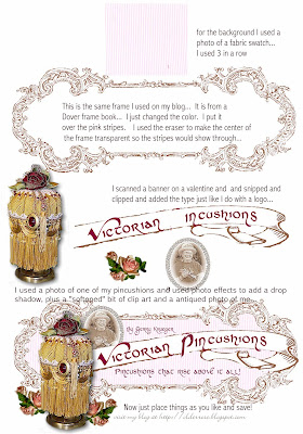 Click to read text: The last step was just to tuck things here and there... Snip and tuck!!
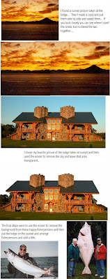 Click to read text:




.jpg)
