Showing posts with label technique. Show all posts

8/24/2018

What you see is not what you have to have!

Sunday I  will be able to get back to my magpie pendant but I wanted to share how my final design comes about.  I both stitch and paint birds a lot.  They are my favorite subject in fact.  I start by looking at as many images as I can and look for something in each image  that appeals to me.  I do start with a few guidelines

1.  I want my bird doing something.  It has to be more than botanically correct.  I want it to be  eating flying etc. anything to give it a little personality.

2.  Except for owls, I avoid straight on views of a bird head.  Always want it side view or 3/4 view.. even better at a tilt.


3.  I make sure my birds most identifiable feature is seen... color, markings, etc. Of course with magpies it is the black and white.


4.Be aware of their feet... They look awkward without feet and feet can add to the balance and activity.


5.  The bird and pose has to fit my space...With buttons it is a circle which is sometimes a real challenge.  With CQ it was usually a square or triangle.


I do not hesitate to crop off a body part such as ears or tail to make an image fit. BUT  the important thing is to make the eye think that it is still there..

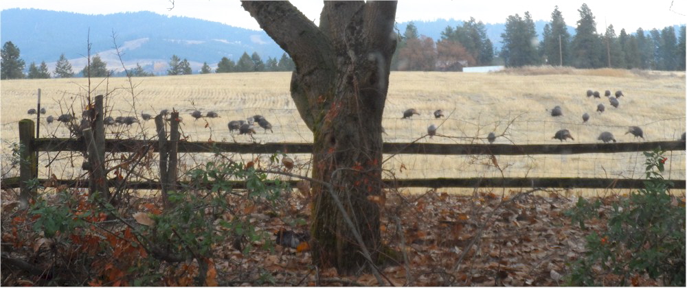
A magpie has an extraordinarily long tail and in this image someone has just shortened the tail and it looks funny.  
 By the time I actually do a rough sketch my magpie on the disc it is a composite of bits and pieces of all the images I looked at.


Below is a tip from 2012 on ways to modify an image to fit your space.  It so happens I use this tip all the time mostly for button painting..  some times a subject does not suit itself to a round button shape and sometime changing an image makes it more interesting... Here are two examples... A rooster in full strut  is not conducive to a small circular shape but if I make a copy and a reverse copy and cut them up I can fiddle with position. By lowering the tail and reversing the head, it is much better for a round shape..
 The same is true for a quail in this position...a strong diagonal which heads right off the block or button.   By reversing the head, it is more interesting composition.


If you liked playing with paper dolls this tip is right up your alley...  

5/24/2017

Great product - new kitchen

Most of my adult life I've had a yellow or cream kitchen...I cook better in a yellow or cream kitchen.  The food looks better in a yellow or cream kitchen and it even tastes better in a yellow or cream kitchen... Only twice in 60+ years have I varied.  Once I painted my kitchen pink which did not last long... It was pepto bismal pink and horrid..

And about 35 years ago I painted it a minty green thinking it would be soothing... It was at the time I was upgrading my cabinets with new doors and getting new counter tops for which I also chose a minty green formica.  I soon hated a minty green kitchen and went back to either yellow or creams... But I was stuck with those minty green counters all those years.


So I was thinking when we were on the cruise that I would try to paint the counter tops and found this product on Amazon.

I thought I would try it and if I didn't like it I would paint sunflowers all over the counter instead.  But I was definitely not looking at those minty green counters one more summer.


I corralled DH into helping to tape off all the edges which was the most time consuming part of the whole process.  The first step was painting it all with black primer and DH was really worried at that point..  Probably rightly so as over the years I have had some not-so-great ideas.


Well it turned out so much better than I even dreamed it could.  The lighting in this picture does not do it justice. There were 3 steps.  The first step was the primer which had to dry 8 hours, then the sponging of three colors which had to dry 4 hours and then the top coat and let it dry 8 hours. It will take a couple weeks to really "cure."  So in a couple days my kitchen looks brand new.

It is really this color. Granted it is not real granite! ...and not as durable but it is breathtaking.  I always use vinegar on my kitchen counters and they advise vinegar or other harsh cleaners not to be used on this surface.  I can do that! And if I do accidentally damage a spot I will paint a sunflower on it.

5/05/2017

Wow.. and easy patching technique

What a special treat to be "chatted up" by one of my favorite people and definitely my favorite crazy quilt artist...Sharon Boggon!!!!

Pop over to TAST and read the interview...
http://pintangle.com/2017/05/04/tast-interview-gerry-krueger-older-rose/

More about vest project....the patches.


Of all the steps in crazy quilting, piecing is my least favorite... I always want to get to the fun stuff as fast as possible....seams and embellishment... Must be a closet drama queen.

I mentioned in a previous post that I preferred paper piecing but thought I was going to have to assemble this   patch by patch to get the look I wanted...  But Marilyn Nepper suggested I paper piece large chunks of it and fill in between.   I thought that was a great idea.  I've sketched four (about 9") areas and will clean them up a bit.  I avoided 90 degree angles because I did not want the jacket to look like it was assembled blocks. I also strived to have all patches close to the same size with no little odd bits or angles...


I stacked materials and cut the patches in threes by just randomly grabbing fabric... I made no attempt to coordinate colors at all.. 


After I had them all cut I kept them organized in baggies pinned to the master sheet.  This has all gone so smoothly and I'm really grateful to Marilyn for suggesting it...

Doing the patches in bunches went so well and so fast...   Then all I had to do was to connect them with similar patches and this I did by hand.  I can heartily recommend this technique to anyone wanting a whole cloth look achieved quickly by paper piecing.


 Now did I want to include black.  I'm was really on the fence with this decision and it has to be decided at this point.

 I spent time looking at a lot of antique quilts and most all of the ones I loved incorporated black with the bright jewel tones..  This color palette is so alien to me that I'm had a hard time getting a feel for it.

I know that the black makes the colors really pop so I went go for it.


1/18/2016

Cut-away transfer AGAIN!!!


Of all the things I have shared I feel my method of cutaway transfer is the absolute niftiest.  If I want to transfer a design or image to a fabric with texture (velvet, linen, lace, etc) or a fabric that has a prominent print or    fabric that is too special to make any mark on, I ALWAYS use this method and apply it to the BACK of the fabric.  There is already a tutorial on this blog but I will go though the steps once again...

Since I work from the back of the fabric  I need a reverse image of my design.  Then I apply an iron-on interfacing to the back of the fabric.   I mark my image into sections. 

I then cut out the reverse image I want to transfer and lay it on the interfacing and trace around the whole image.

Please note:With birds I do not cut out the beak.  I always apply the beak at the very last.


Then I start cutting off the smallest outside bits.... in this case the top of the head and the tail.  Then I place the image back on the interfacing and make a line where I cut away.


I just keep cutting away bits and marking where I cut.


Eventually I was down to the wing which was the last part to cut up.


You can see what is left of the paper image as I cut it all up into small bits.


Then I do some basting with a contrasting thread on the lines...


And when I turn it over  I have my bird on this velour fabric.  There are no marks or chalk  or tissue paper to deal with and the basting stitches are easy to remove as I go along.  You would be amazed how easily and quickly you can transfer even very complex images this way.

So I have gathered my metallic gold threads and sorted them from light to dark and will soon show you how I start the stitching.

11/05/2015

Squish the centers!!!

I just love this piece of ribbon embroidery and I would highly recommend anyone EVER contemplating doing daisies (or daisy-like flowers) to study and keep this photo.  You should notice right away that each flower is different but you know each is a daisy.

And not a single one looks like a fried egg...


Over and over again I see daisies (or daisy-like flowers which includes aster, cornflowers, etc.)
looking like a mass of fried eggs staring right at you...


One trick to force yourself to avoid this is when you draw the centers, flatten or squish them and then draw a irregular shape around the center....and do each one different.  This will force you to add variety to the shapes of the flowers.

At our Sit & Stitch meetings we are doing ribbon flowers with a 4" hoop to use in hexies.  At the last get-together I had them do blue cornflowers using this little trick... This one is by Kathy Streeter and she has already finished the hexie as well.  She not only used blue centers instead of yellow centers, she added a second row of petals in a different shade of blue.


This one is by Teresa Smick and is still a work in progress.  She used a variegated ribbon and also added a second row of petals which added depth and interest. PLEASE NOTE: every center is an irregular shape.

Both these exquisite examples just ooze interest and variety to a simple composite flower... so remember "squish " the centers...


The wild turkeys have flocked up for the winter and are regular visitors now...

4/25/2015

Paper Cutouts and Talented Husband

I have been playing around with elements and placement on the cottage piece.  I can put it on the screen in photoshop and scribble and erase.  But even better I like to play around with paper cutouts.  I've shown this before but it's a technique worth sharing again.

  And my HCWH (handsome,charming, witty husband)  is so talented he can fall sound asleep sitting up holding a cup of coffee and never spill a drop.  He can even do it with a glass of wine.


And my lovely daughter-in-law was here for a nice visit the week before last and we had the best time.   We walked in the forest a lot, hit the thrift stores, and played a lot of scrabble.

11/08/2014

Tips & tricks for awkward corners!


Some times when you are piecing a block you quite often end up with an awkward   corner really too small for a motif treatment..  And Mary's block is a good example except that she has four such corners.  I could put a little motif in each corner but that would not help the problem. 
 
I have a bag of tricks for just this very thing...


1.  I try to bring the patch into block by moving some of its color and adding something that makes the shape less defined.  This time I chose flowers the same shade as the block and moved some down onto the purple along with some foliage.


2. For the upper right corner I chose something bold to attach to it to make it work as a larger unit.  Notice how it overlaps the seams to help include the small patch into the block as a whole.


3. Another option is bring some element from the block down into that patch and it just disappears..


4. Sometimes rather than make a small patch seem larger I divide and conquer to make it smaller... With two or more pieces of trim you can downsize a patch.  On fact it becomes so small it hardly seems like a patch at all.


So now there is some variation in the four small corners which were so similar in size and they all have their own personality..

 
5. Another technique I use often and could have used here is to add a coordinating trim (usually ribbon) to make a block larger.    In this case I could have added a wide purple ribbon to the little purple corner patch which would have doubled its size and made the turquoise  patch smaller.   I use this technique often...


And now the tail...  I didn't want to mark on top of the block so I turned it over and sketched a tail.  I already had the peacock body in place so positioning it was no problem.  Then I did quick basting stitches over my lines.


Then I could turn it back over and embroider over my basting stitches.  I use this technique over and over and over again and have long meant to write a proper tutorial on it... Mary Corbet had an article recently on transferring designs and working from the back wasn't mentioned so I am determined to get a tutorial worked up and send it to her....


So I used all the colors in the block in the peacock tail and carried it right down into the pesky little corner patch!!!!!


4/05/2014

Cording Technique


 I went to see Allie on April 6th and have worked non stop on the suffrage piece ever since and now on the last step...the corners. I basted the batting, quilted all the layers,  did border, border lace, border trim and then proceeded to add the cording around the whole piece...Here  I ran into problems... The cording has 3 ply and a good deal of elasticity.  If stitched too tight it causes the piece to buckle and stitched too loosely it causes the piece to have a wavy edge... plus you have to watch it closely as the twist will twist!!!  I didn't want  the couching stitching to show so I was "floating " stitches between the strands.
 
I initially did it too tight and had to take a good deal of it off and redo it...   Found if I pinned it like so I could avoid the twisting and also keep it flat.  I was worried I wasn't going to have enough cording on my spool and I made it by about 1"... too close for comfort.
 
 
I found if I inserted the needle at a 45 degree angle from the top (between the strands) and then moved 1/4" to the left and went straight back through that NO stitching showed on either side of the cording... Always working at 45 degrees from the top...


Related Posts Plugin for WordPress, Blogger...

Popular Posts